CNET
Apple’s World Wide Developers Conference (WWDC) kicks off this Monday with a keynote from CEO Tim Cook. I’ll be there with CNET’s Shara Tibken and Scott Stein to cover the event so make sure to tune in.
Tune into CNET’s WWDC live blog at 9:00 a.m. PT Monday, June 8
Historically, WWDC is where Apple announces new software releases, so it is likely we’ll hear about Mac OS X, new apps that will run on the Apple Watch and the company’s mobile operating system, iOS 9 .
See also
There have already been several rumors about what we’re getting in iOS 9 such as an improved keyboard, more comprehensive searches from Siri, backward compatibility for older devices, and support for Force Touch with haptic feedback likely released with the iPhone 6S. ( See our iPhone 6S wish list here).
Still, even though I wrote a post last week saying the mobile OS in general has stalled out, I have a few ideas of my own for iOS 9 that I’m hoping to see on Monday morning.
Fix third-party keyboards
iOS 8 introduced the option to use third-party keyboards, and big names people love on Android quickly jumped on board, including SwiftKey and Swype. But as exciting as it was to add these new keyboards to my iPhone, I quickly realized they were really glitchy and didn’t work as smoothly as I hoped.
I’m not sure who to blame here, but if Apple has a way to make using these keyboards easier in iOS 9, it would make it much easier to send messages faster. I still dream of using SwiftKey all the time like my Android-using friends do, but until it’s a smoother experience, I’ll stick with the default keyboard.
Clean up my apps
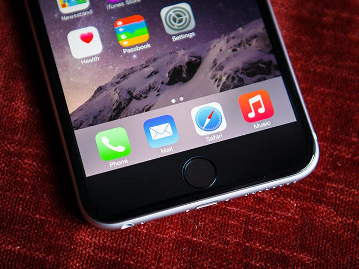
Okay, I actually wrote about this one in a wishlist for iOS 6 (!) and it still hasn’t been fixed. I may be one of the few who care, but as an app reviewer, I often have several pages of apps on my home screen. I know that I can reset all apps on the home screen to clean up those extra spaces, but the consequences are that the apps are then alphabetized, making it difficult to remember where certain apps have moved. The fact is, when you’re used to where your apps are, you know where to swipe to get to them.
iPhone 7: Most-wanted features


+9 more
What I’m looking for is a button that doesn’t rearrange my apps by alphabet, but instead simply uses the existing spaces better by pushing all apps to the left. This way, there would be no spaces, and I could still go to the last screen to see the apps I’ve recently downloaded. Most people probably don’t have as many apps as I do, but I still think this would be a good addition.
Group FaceTime calls
Video calling is nothing new and can be done on almost any smartphone. But one thing iOS FaceTime lacks is the capability to do group calls like Google Hangouts. For Apple’s iOS developers maybe it’s a question of space on the screen or some other technical issue, but I think it would be great to be able to connect with multiple people in different locations to have a conference call.
What I’m envisioning is the main screen where you can see the face of the person talking, but across the bottom would be small icon-size faces of everyone else on the call. The screen would switch based on who is talking at that moment, but you’d still be able to see live reactions from the faces in the icons. There are already other services in addition to Hangouts that let you do group video calls, mostly in business settings, but I still think it would be a great addition to iOS.

CNET
Let me choose the default apps
This isn’t a new idea at all, but since the release of Apple Maps users have wanted to be able to choose which apps handle different types of media. As an example, while Apple Maps has improved over time, I still don’t think it’s on the same level as Google Maps, so it would be great if I could designate that I want all addresses opened on the iPhone to open in Google Maps instead of Apple Maps.
Obviously, this would also work in other app categories like messaging, your Web browser, your email client and even photo management. I’m not saying that the Apple-made apps for these services are bad in any way — they’re actually quite good. But if you let people choose which apps are the defaults for opening particular types of media, it would give us more freedom to choose how our devices function.
Smarter integration of Apple Watch and iPhone
With what we’re hearing about improvements to Siri likely coming at WWDC, this one might be closer than we think. The problem here is better illustrated through an example. My Apple Watch tells me periodically to stand up because I’ve been sitting too long (typing stories like this one) in order to reach my standing goal for the day. I like the feature because it reminds me to get up and move around when I’m usually stuck at my desk.
But what I’d like to see is the watch and my iPhone work together. So, for example, if I were on a flight, I wouldn’t be able to stand every time the watch asks me to. If Siri could get information from my e-mail that I had a flight, it could then let my watch know that I probably can’t stand up so I wouldn’t receive the notification. I recognize that these are functions that are more associated with Google Now, but I’d really like to see them added to iOS 9.
A better native podcast app
Apple has put a few iterations of the Podcasts app in iOS over the years, and it works okay, but I want more. To tell you the truth, I’ve always thought it was a bit buggy and I’ve experienced enough crashes by now that I’ve permanently moved to a third-party app.
What I’d like to see here is an app rebuilt from the ground up, incorporating features from other third-party apps (if possible) with a new design that’s elegant, but simple. I’d also like to see features such as the ability to use voice boost to hear the soft talkers more clearly like you can with Overcast , or more options for fast-forward and rewinding like you find in Downcast. It just seems like it would be pretty easy for Apple to learn from the competition to make the Podcasts app better. Hopefully it’s something that will come sooner rather than later.
Let me hide preinstalled apps
I know I’m not alone on this one because I’ve seen it in the comments sections of almost every tech site that talks about iOS. Here’s the problem: Apple includes apps with every iOS, with favorites such as Messages, the Calendar and Photos. But there are also apps that aren’t necessarily useful to everyone, such as Stocks, iBooks, Videos and the Calculator. Partly it’s because some people simply don’t care whether the Nasdaq rises or falls on a given day or they don’t read books on their phone, but it’s also that there are better third-party apps available.
I think it’s finally time for Apple to give us the choice, but I want to point out that I’m not asking to delete them — only hide them. Instead of doing what most people do, which is to create a folder called “Utilities” or something similar, I want to be able to go into the settings and show or hide the preinstalled apps I want. This way, in a pinch, I could always turn them on again, but I wouldn’t have them taking up space on my home screen when I never use them.
Better battery management with notifications
This is actually a suggestion that I got from CNET colleague Scott Stein, but I really like it. Some apps eat up more battery than others, so what I would like to see is maybe a list of the top 10 battery hogs on my device so I could shut them down when I’m trying to hold my charge.
Furthermore, I think it would be great to see notifications for when iOS thinks an app is being particularly egregious in its energy consumption so I can judge whether its usefulness outweighs its energy intake. This would make it easier to see how much charge you really have left and you could make sure the big battery hogs were turned off.


