Grooveshark
Music-streaming site Grooveshark is launching a new look designed to encourage people to share more.
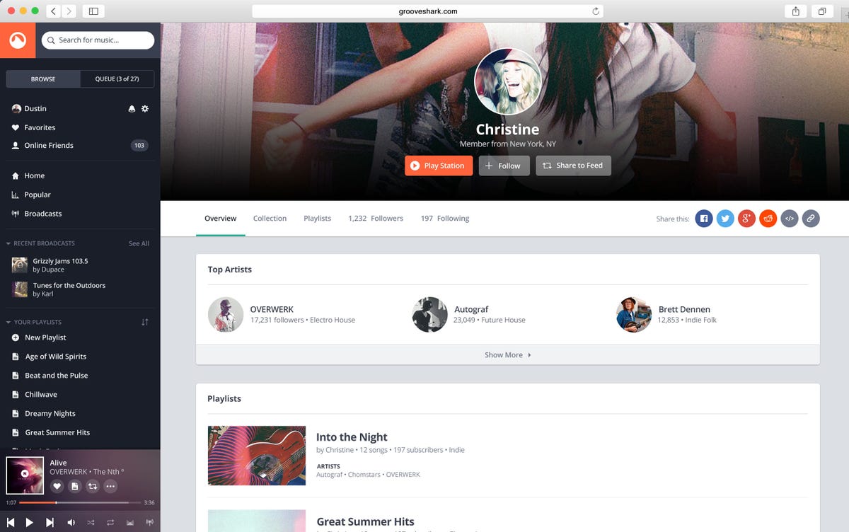
Due to roll out for all users over the coming week, the update offers more of a community-minded approach in which Grooveshark users can discover music through fellow users and discover fellow users through music. The site also spiffs up its overall design and layout with an interface designed to be more user-friendly. In addition, Grooveshark users are meant to find it easier to navigate the site with repositioned features and controls.
Grooveshark faces an online world filled with competitors such as Pandora, Spotify and Rdio, so keeping current users tuned in and attracting new listeners is important. The community aspect is one key feature designed to appeal to people interested in the social realm of sharing and discovering music.
“We really heard from our listeners,” a Grooveshark spokesman said Wednesday. “This new release is focused around community interaction and sharing, with an improved navigation designed for listeners and from listeners. It represents the biggest user interface upgrade in the company’s decade-long existence.”
The new and redesigned features include:
- Music feed. The feed displays a list of songs from the genre that you select. From the feed, you can share songs, albums, artists and playlists with other Grooveshark users or with people on Facebook, Twitter and other social networks. The feed itself tries to learn from your musical tastes to display songs that appeal to you.
- Sharing. Grooveshark touts easier sharing as a key benefit of the redesign. You can tag a genre or a friend. Tagging a genre lets you share it within a specific category of music. Tagging a friend lets you share music with specific people.
- Sidebar. The previous layout had features scattered in different places. The new sidebar places all the major Grooveshark features in one location. You can search for music, manage your account, access your playlists and manage your songs from this spot.
- Always-on broadcasts. You can now listen to live broadcasts hosted by other Grooveshark members and even tune up your own broadcast to share your favorite music. The broadcasts also have a social nature as you can chat with other broadcasters and Grooveshark listeners. You can even queue up your own broadcast to play while you’re offline.
- Customizable profiles. You can add cover art to your profile, playlists and broadcasts. You can also organize your music and playlists in any order you choose.
Subscribers who pay $9 a month for premium features have already seen a beta preview of the new site to offer their feedback. Grooveshark said it will invite all users to the new site by month’s end. In the meantime, the preview is here.
Grooveshark’s mobile site will incorporate the same new look as its full desktop site.


