Screenshot by Stephen Shankland/CNET
Google, unlike much of the rest of the world, hasn’t given up on browser bookmarks.
Bookmarks date back to the earliest days of the Web, providing a way for people to keep a record of important websites and pages they want to revisit. Organizing bookmarks is drudgery for the most part, but Google has released a new extension for its Chrome browser called Bookmark Manager to try to make the process useful and engaging, if not exactly fun.
It’s a laudable goal, considering how much personal data is squirreled away in those archived links. But it’s not clear Bookmark Manager’s flashy graphics will really do much to dust off this part of the Web. Unlike two decades ago, browsers now have tightly integrated search engines as well as typing predictions for the address bar that help you rapidly reach the sites you want. Updates to Bookmark Manager, such as integration with Chrome’s new-tab page, could raise the profile of bookmarks, though.
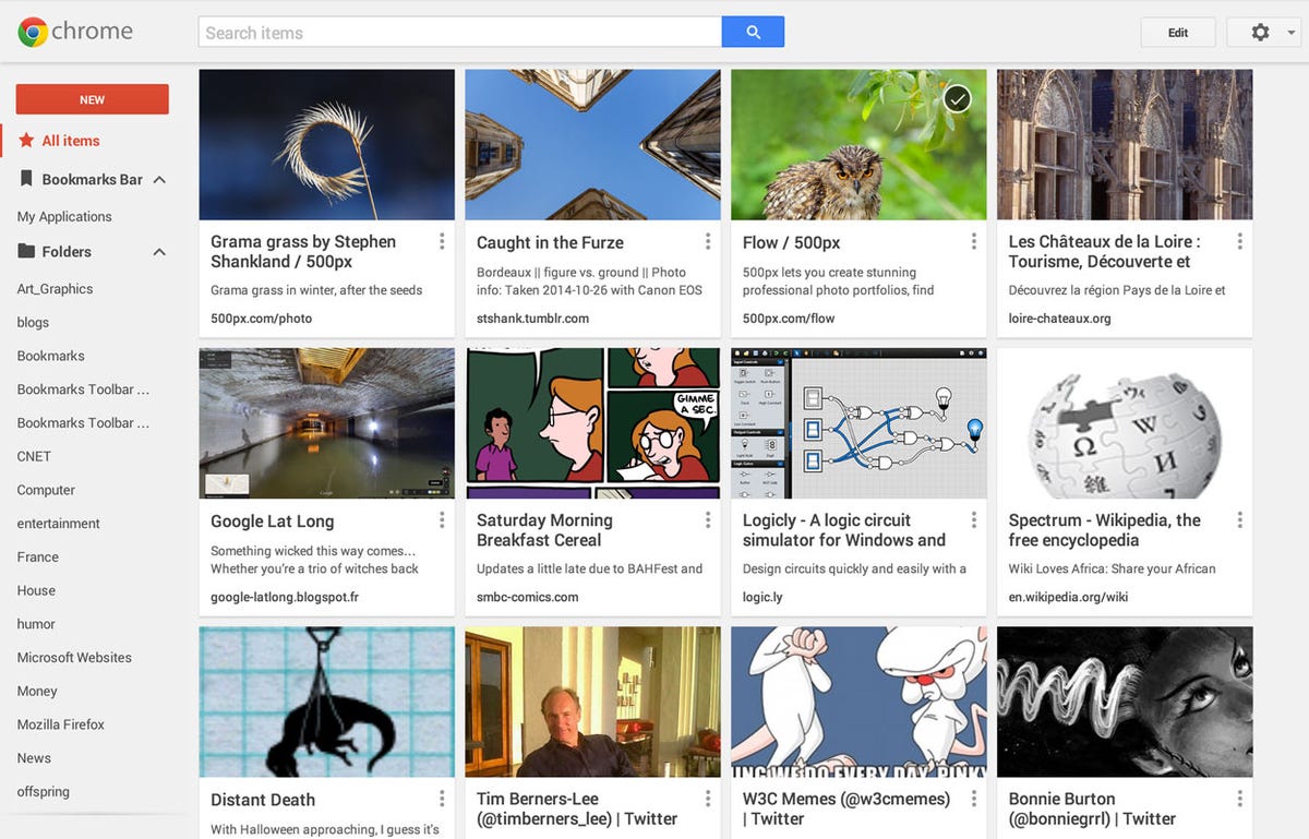
Bookmark Manager does away with the typical bookmark management interface that’s persisted for years, the hierarchy of folders and subfolders filled with textual titles for websites you want to record. The tool puts graphics front and center, both when you’re registering a site as a bookmark and when you’re dealing with bookmarks you’ve already saved. A grid of thumbnails shows your bookmarks: for a Flickr page you’ll see the photo in the bookmark; for Yahoo’s you’ll see the company’s logo; for Zillow you’ll see the site’s image of a suburban subdivision; for a blog you’ll see the image from the top item.
Getting graphical
It’s more than a cosmetic difference. The imagery is more engaging and could help people find sites faster than reading lists of text. Each bookmark is an active card with a pop-up menu to control it. And Bookmark Manager updates the image — something that helps keep it current but that also could trip up people who associated a particular bookmark with a particular image.
Where Bookmark Manager gets more Googley is with some of the systems’ smarts. For one thing, the tool will attempt to automatically categorize some bookmarks. For another, it’s got a search interface based not just on bookmark titles but also on the contents of the Web pages. After you run a search, the bookmark thumbnail images swoop around the page as they’re reordered by search result relevance. And bookmarks will sync across the different instances of Chrome you’re logged into across PCs, tablets and phones.


screenshot by Stephen Shankland/CNET
Bookmark Manager is a Chrome extension for now, but it’s easy to imagine that this will become the standard way of dealing with bookmarks in Google’s browser. Integration into Chrome for Google’s Android operating system and Apple’s iOS competitor also seems plausible, especially since the Bookmark Manager fits into the touch-friendly, uncluttered Material Design styling Google has embraced for spanning all sorts of devices. A Web interface could bring the service to other browsers easily enough.
Bookmark Manager is the culmination of work going on for months as Google tested a new bookmarking interface it called Stars. One of the features built in since those days is bookmark sharing, something that could help Google rank site importance based on social signals.
Not all features of Bookmark Manager work if you have Chrome set to encrypt browser data.
Modernizing bookmarks
It’s a thoroughly modern take on browser management. But peoples’ bookmarks today are often dusty archives rather than a list of top sites. Bookmark toolbars place frequently needed sites as links on a convenient strip across the top of a browser window, but the rest of the bookmark list can age as websites fade from the Web.
Bookmarks also are less relevant with new ways to get to preferred sites. Address bars autocomplete Web addresses as you type based on live search results that include the Web and your own browsing history. The previously blank page that showed when you opened a new browser tab now is often filled with thumbnails of frequently visited sites, too.
But the current Bookmark Manager may not be the end of the road. As long as Google is categorizing bookmarked sites for you, why not automatically bookmark sites so you don’t have to? And why not merge Bookmark Manager with that new-tab page, too, so people see it a lot, not just when they specifically launch it?
Maybe there’s a way to revive bookmarks so they’re useful without requiring people to invest lots of time in organizing them. That’s the Google way, as shown also in Google Drive’s file list and Gmail’s archive feature: Just dump everything into one giant filing cabinet and let search retrieve what you want.
(Via The Next Web)


