Google launched the rollout for Android 5.0 Lollipop on Monday, but it also announced that Google Calendar and Gmail would receive significant updates.
Google’s Gmail for Android got a new design update that continues to roll out at the time of this post, with a new look and inbox tweaks that should make it easier to use.
Obviously, Gmail is something you get automatically on all Android phones, but new devices running Android 5.0 Lollipop and those running Android 4.0 (Ice Cream Sandwich) and above are getting a new version of the app, with some cool new features worth showcasing here.
New design
The first thing that jumps out at you in the new Gmail is the red stripe across the top. You still have the slide-out menu on the left where you can switch accounts and view by Gmail’s categories that include Primary, Social, Promotions and Updates.
But the new Gmail also feels much cleaner, using the new material design aesthetic, introduced in Android 5.0 Lollipop. More white space and the flatter look bring Apple’s iOS to mind while remaining decidedly Google. A small tweak to circular icons for your contacts (as opposed to squares in the older version) adds to the feeling of space, making the new version feel roomier.
You’ll also notice in the slide-out menu that every category now has an icon associated with it, making it much easier to quickly browse and find with a glance.
Not just for Gmail
Probably the biggest change to the new Gmail is the ability to add email accounts from other services. You’ll now be able to add both IMAP and POP accounts like Yahoo Mail, along with your Outlook.com email addresses, right in the app. In the past, you could add these accounts to your Android phone, but you’d only be able to view your mail in the stock Email app, not in Gmail.
This is a big step toward making the Gmail app for Android your go-to email client — if it wasn’t already — because you get a lot more flexibility with access to all your accounts where you had none before.


Screenshot by Jason Parker/CNET
Interacting with your inbox
Some of the changes to Gmail are relatively minor on the surface, but will be much more convenient as you use the app daily.
A new compose button now sits right in the lower right of your screen so can jump to writing a new email immediately. There are also new reply buttons at the bottom of every email so when you finish reading a message, you have access to quickly reply.
Another change is how many of the most common actions have been moved out of hidden app menus and into the Gmail app interface. In your inbox, there’s a button at the top-right for quickly moving emails (or groups of emails) to a different folder, while in the compose view, a new attachment button now sits in the upper right. These features are not new in the sense that you didn’t have them before, but moving them out of a menu and into the interface makes them much more handy and efficient.


Screenshot by Jason Parker/CNET
New options for swiping
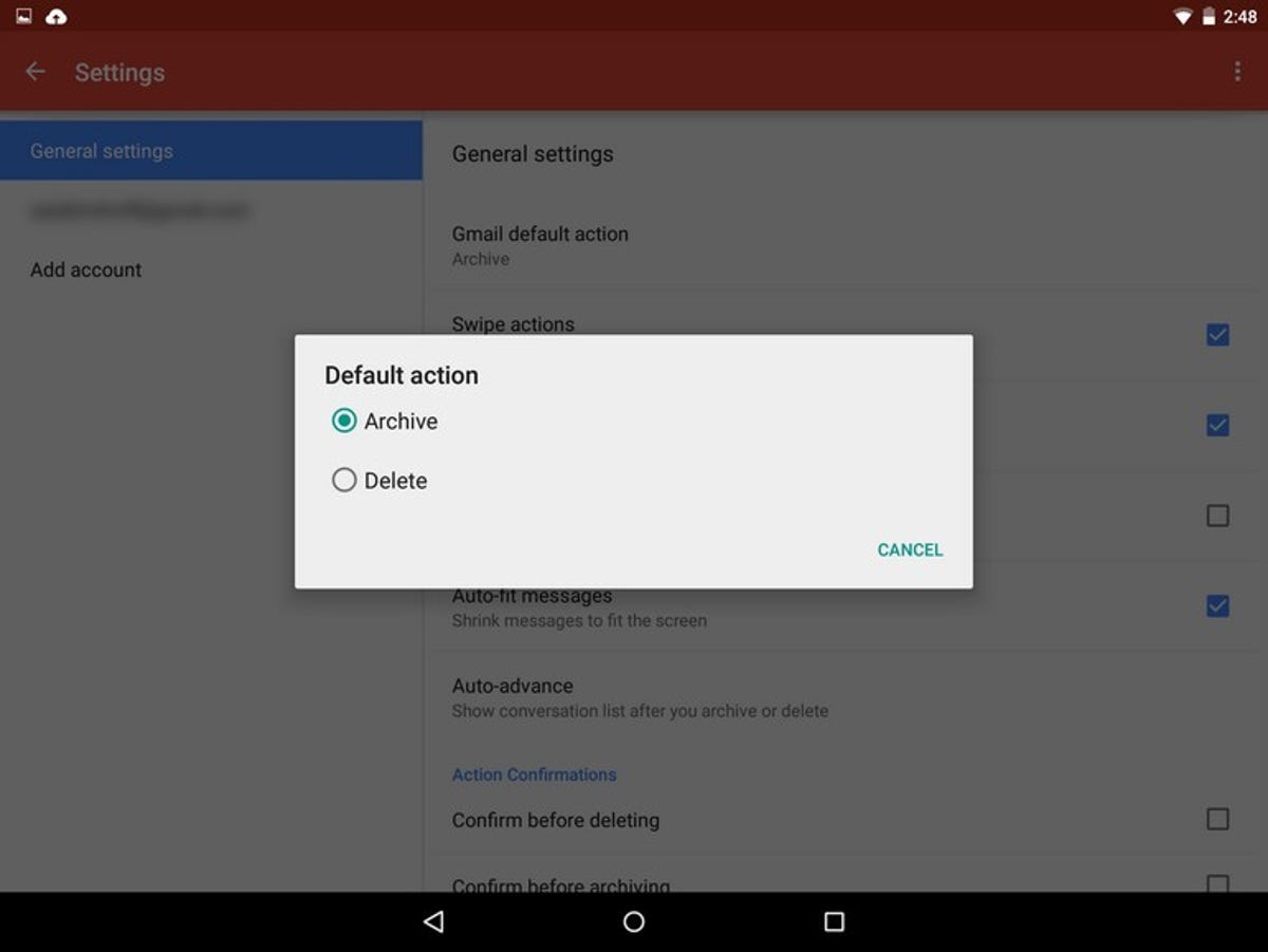
In the old Gmail app you only had the option to delete emails with a swipe. But a somewhat hidden new feature in the settings lets you choose how you want to deal with new messages.
If you go into the general settings, you now have a listing for the Gmail default action. Here you can set it to either Archive, which saves the email in your account, or Delete the email entirely. Once you’ve made your selection, every time you swipe an email, it will default to that setting. Again, this is not a groundbreaking change, but it’s great to finally have the option.
An overall better way to Gmail
The new Gmail app isn’t going to blow you away with new features, but instead, many smaller tweaks refine the interface to make things easier to get to. The ability to access other non-Gmail accounts is undoubtably a huge plus, reducing the number of apps you need to open to check your email.
Still the sort of undefinable change here is mostly about overall feel. There’s more space and it doesn’t feel as compacted as you browse. And with more buttons moved out of menus and into the interface, common actions are fewer taps away, making your daily email reading more efficient.


