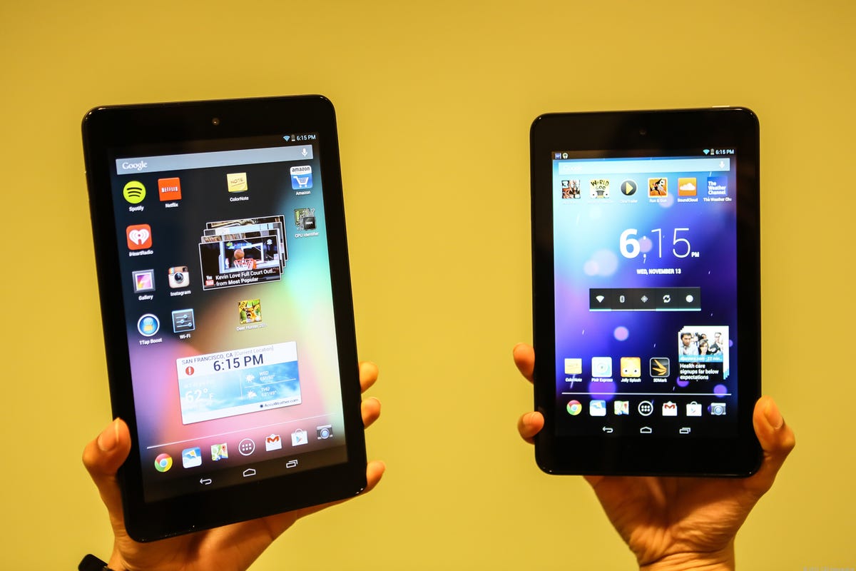
Despite the sometimes overwhelming faceless sea of black bezels, cheap plastic, and wordy model names, tablets continue to come into their own, becoming the slimmer, faster, and lighter portable devices we’ve always wanted.
In 2013 the blurred lines of tablet/laptop hybrids continued to confused us all, budget slates came crashing onto the scene like a wrecking ball, 2012’s best tablets got lucky with substantial upgrades, and LG even came out to (Google) play again.
Here’s my take on the best and worst of all things tablets for the year 2013. Care to compare? Share your tablet highs and lows of 2013 in the comments section below.
Highs


Josh Miller/CNET
Budget tablets
For most budget tablets, lackluster and buggy performance is more common than not, but performance standards for these affordable slates are slowly rising as their prices stay competitively low. The good thing is some 2013 releases show a promising turn toward low-priced slates that offer not only a good value, but good performance.
Notable standouts include the Dell Venue 8, a smoothly performing, no-frills slate running pure Android 4.3, and the Asus Memo Pad HD 7, which boasts a sharp screen with an impressively wide range of color. The budget trend makes tablets more accessible and, with some manufacturers stepping up their game, these promising devices may just signal the end of choosing between performance and price.


Josh Miller/CNET
Apple iPads with Retina Display
Nothing was the same after the original iPad was released in 2010 and — whether you love ’em or hate ’em — Apple released two of the best tablets of 2013. The new tablets feature Retina Displays (first seen on the third-generation iPad) and their signature sleek aesthetic matched with smoother, speedier performance continues to propel them to the top of the tablet totem pole.
The iPad Mini received the high-resolution display it should’ve had in the first place and the iPad Air bared a new ultraslim design complemented by the high-end aesthetic Apple is known for. Even though both tablets rock a Retina Display, the Mini’s range of color doesn’t impress as much as the Air’s, and both fall short when compared with Amazon’s Kindle Fire HDX tablets.
Click here for a full review of the iPad Mini and here for the iPad Air.


Josh Miller/CNET
Amazon Kindle Fire HDX tablets
Amazon’s Kindle Fire tablets only got hotter in 2013 with the release of the HDX lineup. The new slates rock a revamped lightweight design, powerful processors, stunning screens, and useful new features. Not one to offer underwhelming upgrades, Amazon packed the tablets with the usual perks for Prime members and the new, innovative Mayday button that allows almost-instant tablet help in the form of a video chat with an actual human being.
The new HDX slates cost more than the 2012 HD models, but they’re still some of the most affordable premium slates on the market. Amazon is also keeping last year’s Kindle Fire HD around for the same bargain price of $199.
Read the full review of the Amazon Kindle Fire HDX 7 here and the Amazon Kindle Fire HDX 8.9 here.


Sarah Tew/CNET
Supersharp screens
For tablets, this year’s holy grail of features was a crisp and colorful screen. The superhigh resolutions and sky-high pixels-per-inch (ppi) on some of 2013’s top tablets make last year’s screens look like dull underwater mosaics. Even some budget tablets got in on the trend, like the Asus Memo Pad HD 7, which managed to impress with its impressive range of color and included calibration software.
Tablets like the Amazon Kindle Fire HDX 8.9 and Apple iPad Mini continue to raise the bar on display quality. Their 2,560×1,600-pixel-resolution screens make everything from movie watching to Web surfing a visually stunning experience. However, the Kindle Fire HDX 8.9 takes the cake with its accurate color reproduction and higher 339ppi.
Lows


Josh Miller/CNET
Cameras
The quality of tablet cameras started at the bottom and they’re still there. Despite the leaps and bounds made in sleek design, sharp displays, and useful features, front and rear tablet cameras are still much-neglected features that deserve substantial upgrades.
The front-facing camera provides the important functionality of video chatting and — depending on your level of narcissism — the occasional self-portrait. However, most front-facing shooters result in washed-out and fuzzy photos that barely rival the best camera phone of 2007. If I wanted an unflattering image of myself I’d look at a funhouse mirror or download one of those weird apps that shows you what you’ll look like when you’re old.
When it comes to using a tablet’s rear camera, let’s be real for a second; it looks a little ridiculous. That being said, if you’re publicly sacrificing your cool points to snap a shot with your slate, I would hope that the camera would deliver a satisfactorily sharp and colorful photo. Unfortunately, this is not often the case and you’re just a dork taking a dull photo with a tablet.
To be fair, the Microsoft Surface 2 and Apple iPad Air received significant upgrades to their cameras this year. The Surface 2 houses worthy front and rear shooters that perform well in low light and deliver detailed, colorful, and sharp images, while the iPad Air has an improved front-facing camera with better white balance, clarity, and low-light performance.


Josh Miller/CNET
Toshiba Excite tablet lineup
Despite their names, these tablets were not exciting. Toshiba’s 2013 Excite family sounded promising on paper, featuring high-end speakers, sharp screens, and a pure-Android model, but their performance underwhelmed every CNET editor that got his or her hands on one.
The Toshiba Excite Write failed to sway us with its stylus and the Excite Pro‘s impressively sharp screen couldn’t outshine its buggy performance. Even the 7-inch budget model offers disappointing functionality for the price.
Despite the impressively varied selection packed with seemingly useful features and promising specs, Toshiba’s 2013 tablet efforts fell short in execution and excitement.


Sarah Mitroff/CNET
Android OS upgrades for tablets
Google released one of the best small slates this year in the Nexus 7, but the Android 4.4 KitKat operating system update failed to wow us with its tablet functionality improvements. The lack of unique or useful tablet features failed to elevate the slate experience in a way a big upgrade should.
This KitKat update primarily benefited owners of older Android devices by bringing their OSes up-to-date for a more consistent Android experience across all handsets. However, in a year that saw a revamped (and colorfully tacky IMO) Apple iOS 7, and the upgrade to Windows 8.1, Android fans were left in the lurch with little to roar about.
What’s next?
2014 will bring the usual slew of new tablets and, hopefully, upgrades to models that didn’t see a 2013 refresh, like the Google Nexus 10. I expect tablets to continue to shrink in thickness and weight, keeping the trendy sleek aesthetic alive, and for prices to become more competitive than ever. Check out what Eric Franklin expects for tablets at CES 2014 and leave your own 2014 tablet predictions, along with your tablet highs and lows, in the comments section below.


