I’m glad I took a little extra time to get to know Adobe Experience Design CC (XD), the productized version of the Project Comet that Adobe unveiled in October 2015. If I had written this as planned on the day it launched my thoughts would have been far less charitable. That’s partly because Adobe’s Previews — what we used to call public betas — tend to be equal parts intriguing and frustrating to work with.
XD represents the company’s first foray into modern app design and prototyping that doesn’t involve retroactively cramming features and alternative interfaces into existing products. That adds another dimension: Adobe’s entering a market stuffed with competing products that range from small and nimble tools to complete idea-to-app packages.
Initially, XD is only available on the Mac
(and only in English, though Adobe will be rolling out localized versions). It will be free with Adobe ID (download here) until it’s out of preview; in other words, until it’s a real product. At that point, it will probably be engulfed by the Creative Cloud pricing ecosystem.
Adobe Experience Design goes with the flows (pictures)


+11 more
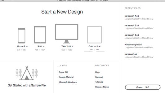
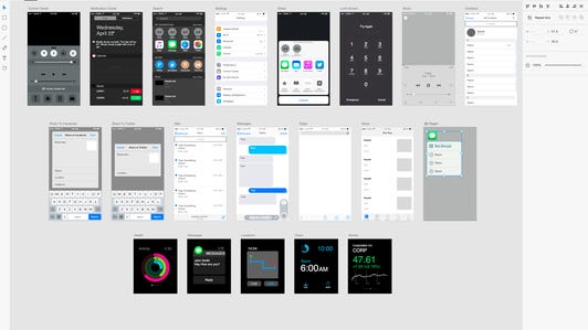
It consists of two modules: Design, where you create your mockups for mobile and Web platforms using basic graphics and text tools, and Prototype, where you assign the flows from screen to screen. You can preview operations, share to an Adobe site for collaborators to view online and export graphics as either SVG or PNG. The interface is typical, with tools on the left and properties on the right.
Like all of Adobe’s previews, XD has a limited feature set of which a few capabilities stand out: repeating grids, the wiring interface and the automatic masking. Repeating Grid let you create arrays from selected objects by dragging out the bounding box; it’s a really nice tool that I want to see in Illustrator. If you drag an image onto a shape, it automatically masks the image. And the wiring interface is a very fast way to create screen flows by simply dragging from one connector to another.
It’s perfectly functional in the sense that it’s reached minimum-viable-product status. And it’s actually a great learning tool for beginners, once some of the mysteries of its operation become clear to you. But this is Adobe, not some random startup in 2014. Adobe really needs to produce a minimum-viable competitor for wildly varying software like Sketch, InVision, Justinmind, UXPin and tons of others.
In its preview state, It lacks wireframe columns and guides (though it does have smart guides), styles, CSS export, modern type handling, layers, device-based testing and sophisticated interactions and a plug-in/add-in architecture just to name a handful of capabilities. Some of those are in the road map as Adobe works to reinvent device preview and come up with some innovative way to add layers. Support for Windows waits as the company works on optimizing XD for specific platforms rather than making it the same cross-platform.
XD won’t be a real contender until it’s hooked into Creative Cloud. The strength of some of the best competitors is their ability to land right in the middle of your workflow, ingesting assets, facilitating revisions and generating output in ways that makes the each step in the process more efficient. All of that will come once it’s plugged into the Creative Cloud workflow, with capabilities like working with linked assets from Photoshop and Illustrator, taking advantage of color themes and Typekit fonts or using CC Libraries to share and sync assets. At the moment, it can’t import a PSD file — even flattened — or video.
Eventually — I guess about 18 months, given Adobe’s aggressive monthly update schedule — I think XD might start to be a great tool. For Adobe’s sake, though, I hope that’s not too late. The sluggish uptake on its mobile apps (though I’d take the survey results with a grain of salt) proves that just because Adobe builds it doesn’t mean they will come, especially if there are already great alternatives.


