Yesterday we performed a field test of the turn-by-turn directions on both the iOS 6 Apple Maps app on the iPad and Google Maps on a Samsung Galaxy Tab. Both fared pretty well with getting us to our destinations, but Google Maps came out on top. As we pointed out yesterday, a number of people have been
complaining about the Apple Maps app, from inaccuracies to poor directions.
Today, in part two of our testing, we did a number of searches for landmarks and other destinations to see how each app performed. After only a couple of tests, it was clear Google Maps was easily the superior app with much more information than Apple’s replacement Maps app.
To test out the apps, we focused on four aspects of local search results: info windows, generic search terms, accuracy of landmarks, and level of map detail. What becomes clear very quickly is that Apple has a long way to go to match Google’s offering, and in some cases, the difference is downright shocking.
Info windows
One of the first things we tested was the usefulness of each app’s pop-up info window, which gives an assortment of information about a particular business or landmark. Apple’s info window is powered by Yelp, while Google’s aggregates its data from several sources, including Google Places and the Google-owned review database Zagat.
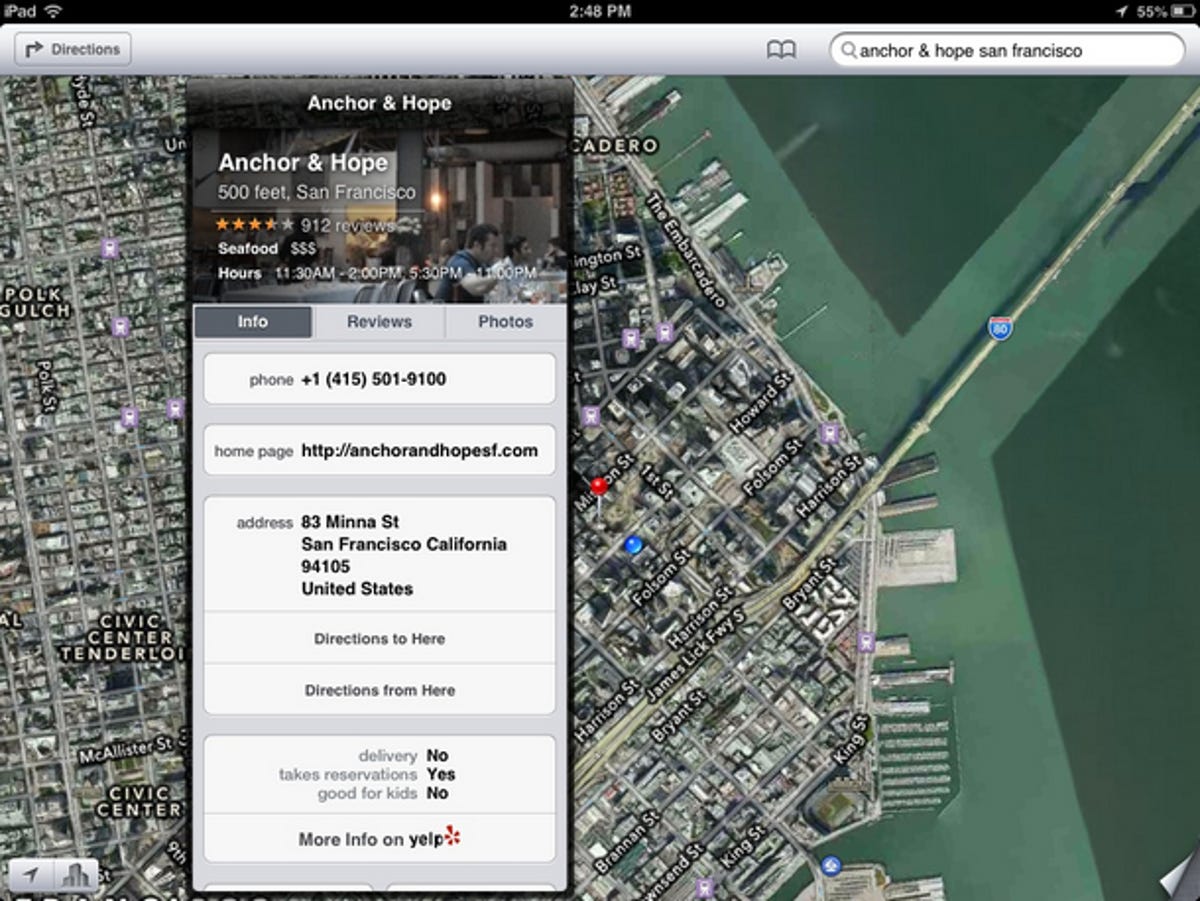
Using an iPad running Apple’s Maps app, we pulled up the listing for the Anchor and Hope restaurant here in San Francisco, and as expected we got all of the restaurant’s vitals, reviews, and user-uploaded photos, all courtesy of Yelp’s database. Other convenient Yelp features were available as well, like Check-ins, Quick tips, and the capability to add photos. And of course, from the info window, we could easily jump to more information on Yelp itself, provided we had the Yelp app installed.
CNET
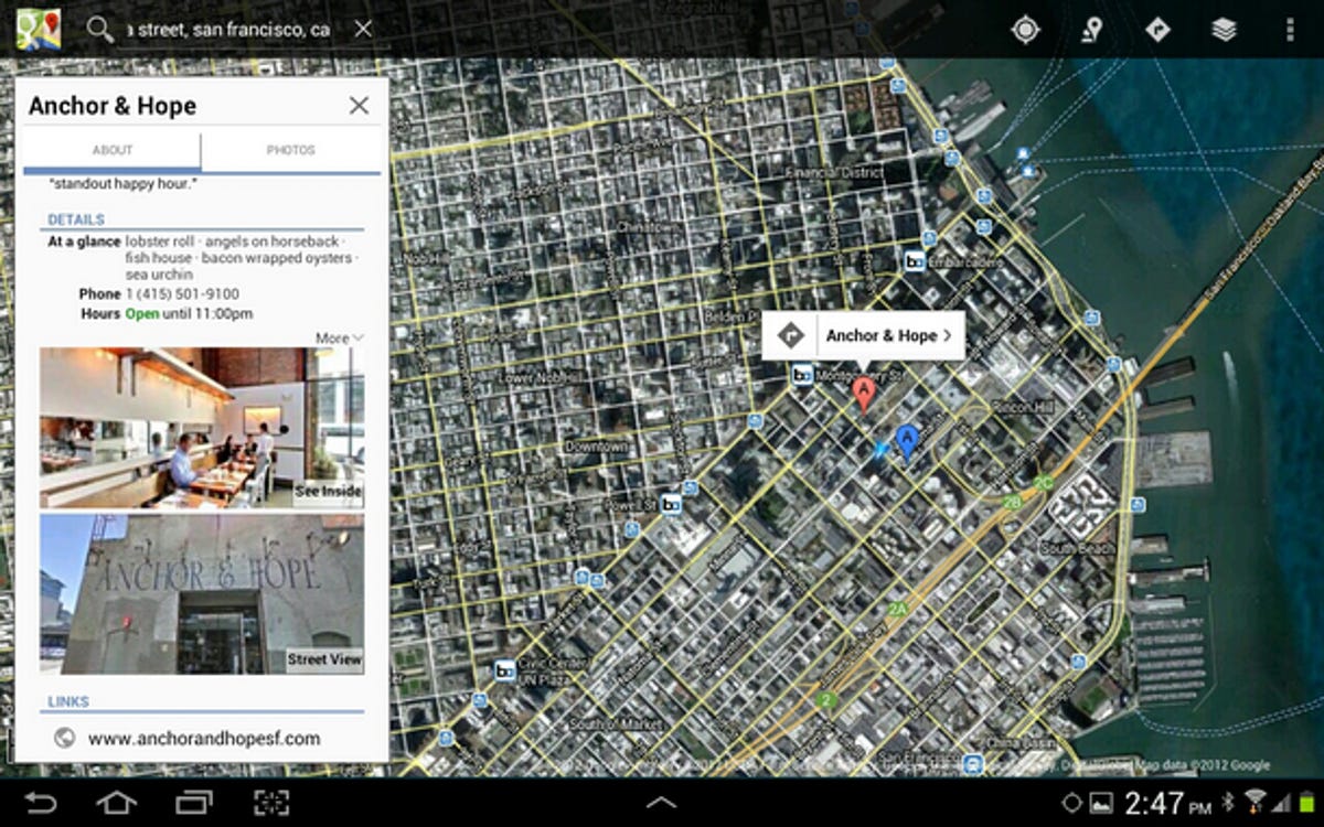
Meanwhile, Google’s info window displayed much of that same vital info and a whole lot more. Since Google aggregates data from multiple sources, it had a distinct advantage here. It even linked out to reviews on Google, Yahoo, Urbanspoon, and Allmenus. Plus, we were able to easily jump to Street View and even an indoor panoramic view of the restaurant. Granted, the panoramic view isn’t available for all listings, but the reality is that no such feature is available at all on Apple’s Maps app.

CNET
Generic search terms
One common use for a maps app is to search for generic items like “pizza” or “coffee.” It’s easy to imagine craving one of these items but not knowing where to get it, so we tried to play out a typical scenario.
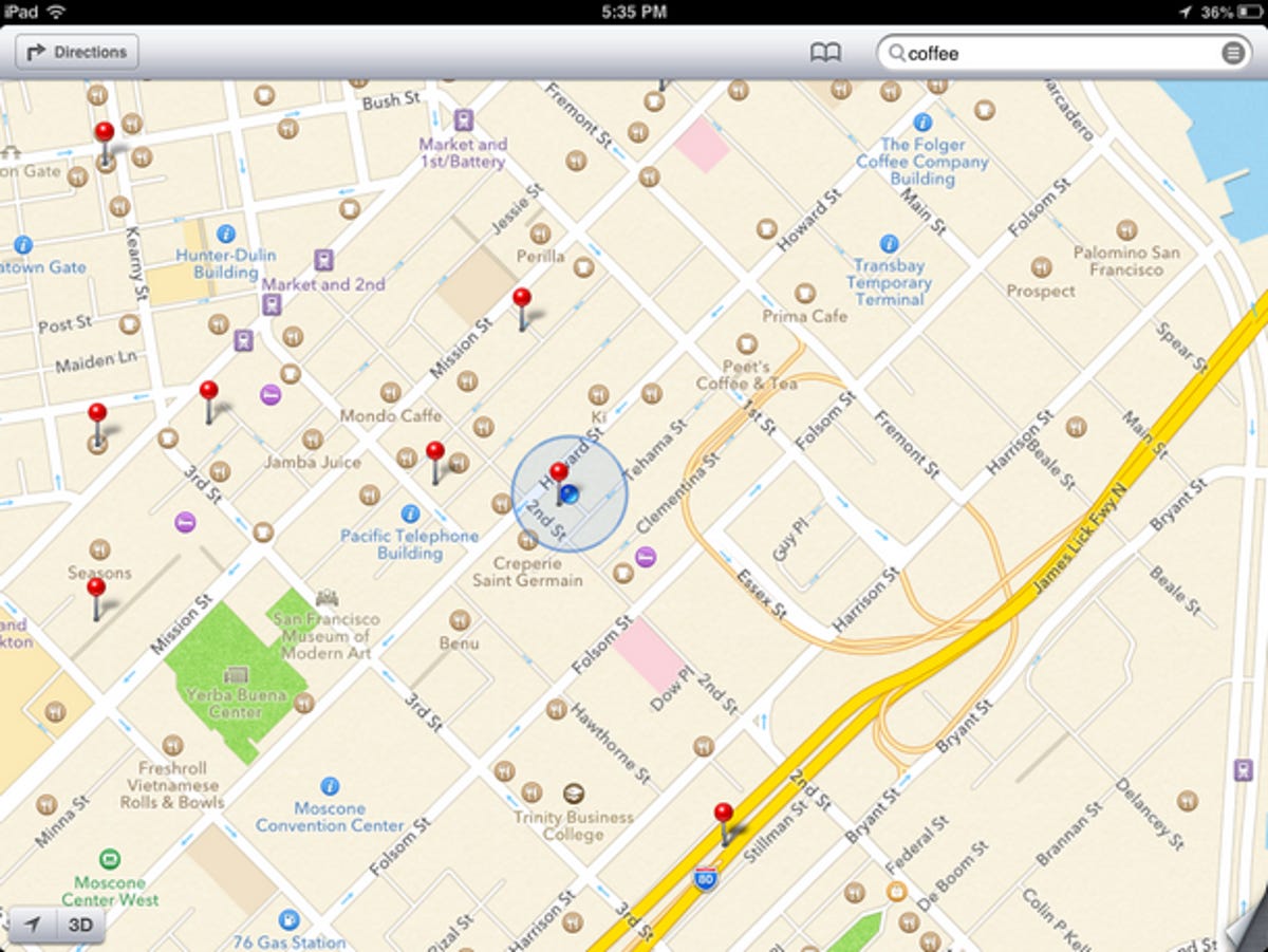
When we searched for “coffee” on the iPad, the red pins dropped, plotting out a number of local coffee shops, just as we had expected. However, we were surprised to notice that a number of shops that we knew of were called out on the map with tiny coffee cup icons, but they weren’t included among the red-pinned search results. In fact, the red-pinned search results accounted for only a small fraction of the coffee shops in the area.

CNET
On the other hand, searching for “coffee” on Google Maps yielded at least twice as many results, all of which were clearly marked by red dots. Also, those results with Zagat ratings were marked by larger red pins. Clearly, the user experience here is superior.


CNET
Accuracy of landmarks
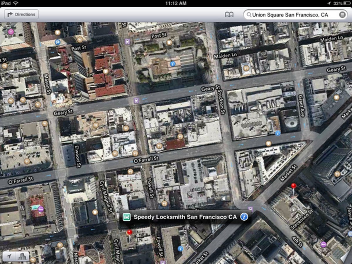
Next, we tested the accuracy of each app as we searched for landmarks around the city. Apple was up first, and we tried to give it an easy one — San Francisco’s most visited block, Union Square. While neither of us expected Apple’s Maps to slip up on such an easy landmark, the Yelp-powered Apple Maps failed, as it returned the address of a locksmith (that probably described itself as close to Union Square) located more than a couple of blocks away from our target. Needless to say, this was not the address we were looking for.
When we searched for Union Square with Google Maps, the results were remarkably different, as the app dropped a pin right in the center of the famed landmark. If we were tourists, this would’ve been exactly what we were looking for. Hitting the Navigation key at this point would even lead us to the front entrance of the Union Square parking lot.

CNET


CNET
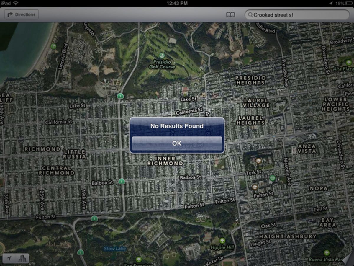
As another test, we tried throwing the apps a curve ball by searching for a less specific search term: “crooked street sf” Again Apple failed miserably, as it displayed no results, while Google hit it out of the park by showing the exact part of Lombard Street that we were looking for.

CNET


CNET
Level of map detail
Throughout these tests, what became clear was that Apple’s Maps app was consistently lacking in the details department. While Apple certainly showed an admirable number of clickable restaurant and shop icons on its maps, we liked that Google plotted out the actual names of businesses. This saved us from having to click around on each icon to see exactly what we were looking at. San Francisco’s BART stations were also clearly discernible from bus stations in Google Maps, while Apple simply lumped them all together under its generic public transit icons. Interestingly, we even found a BART station missing (Civic Center) from Apple’s map. Further, when we enabled Apple’s Hybrid view, which includes an overlay of satellite images, almost all of these details disappeared. Google Maps, however, maintains its high level of detail, with or without satellite images enabled.
When we looked up the University of California, San Diego, on both apps, the difference in their levels of detail was immediately apparent, at every zoom level. Apple gave almost no campus information, save for a few major street names, while Google plotted out buildings, dorms, parking lots, fields, and just about everything else on the college campus. So, you can imagine which Maps app would be more helpful to a visiting student or parent.


CNET


CNET
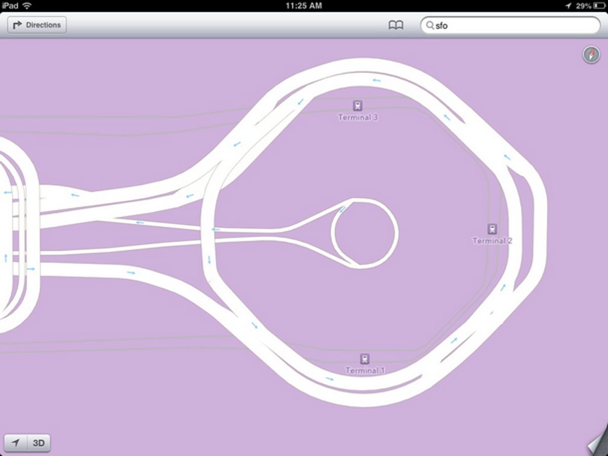
Finally, we took a look at the San Francisco International airport on both apps, and the results were startling. Apple showed nothing but the relative terminal locations, while Google stunned us with plotted out ticket counters, restaurants, shops, Internet access stations, exits, and countless other useful details. We were even able to explore all of the airport’s five floors, thanks to Google’s Indoor Maps feature. Granted, Google doesn’t have this level of indoor data for every building, but it does have coverage of many major airports, shopping centers, hotels, museums, and more. And its list continues to grow.

CNET


CNET
Conclusion
As you can see, this was really no contest. For local searches of landmarks, level of detail, and even the interface for info windows, Google Maps wins out in every category. It’s no secret that Apple is new to the maps game, but the startling lack of detail and inaccurate location information really shows it wasn’t ready for prime time. You can bet that over the next couple of weeks Apple will be working furiously to correct the mistakes and add more details, and, as a crowd-sourced maps app, the users will be adding their share of information too. In the end, the Apple Maps app will probably improve over the coming months, but it’s clear that Apple has a long way to go to compete on the level of the tried and true Google Maps.
Read part one of this series, in which we test turn-by-turn directions using Apple’s Maps app and Google Maps.


