In addition to introducing a number of new features, hidden gems and new and useful privacy settings, the Windows 10 April 2018 Update adds a fresh coat of paint to Microsoft’s web browser. You’ll see Microsoft’s Fluent Design in Edge’s title bar, where it now offers a pleasing translucent effect rather than drab gray, and you’ll undercover a number of new design tweaks and features. Here are the top five additions to Edge.
Tab muting finally arrives
Edge finally catches up to Chrome and Firefox by letting you mute tabs with a single click. You know the drill: Click the speaker icon of a noisy tab to mute whatever audio is playing, and click again to unmute. It’s actually easier than with Chrome, which forces you right-click and then make a selection from the contextual menu to mute a tab.
Autofill forms finally arrives
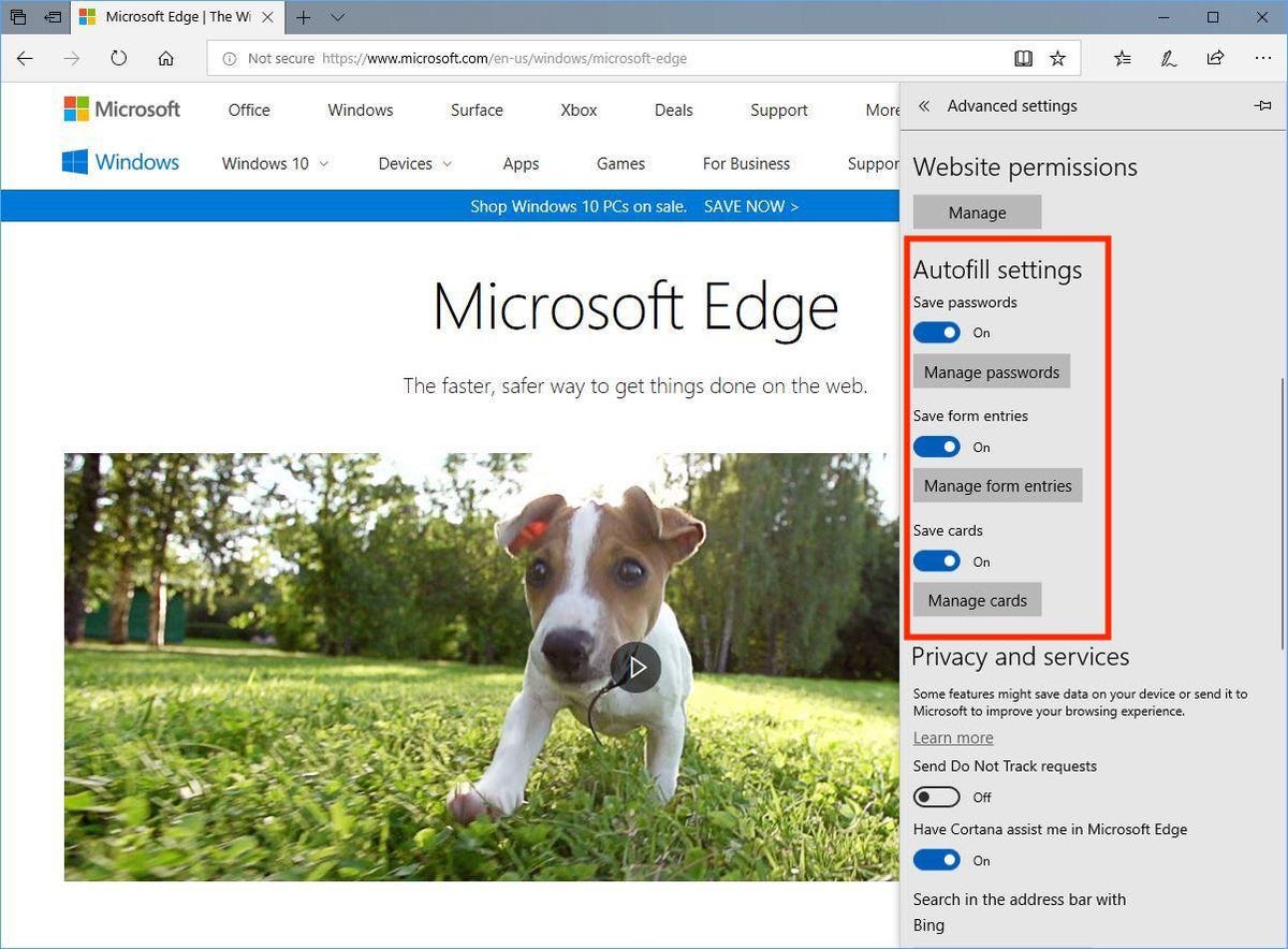
Edge also catches up to its browsing competition by now offering to autofill pesky web forms for you. Open the Settings panel, scroll down and click the View advanced settings button and you’ll see a new Autofill settings section. Here, you can set it up to save passwords, form entries (name, address, email and so on) and credit cards. The ability to manage passwords isn’t new, but the ability to create different profiles to autofill forms and add credit card information is. And it’s very much appreciated. One final note on credit cards: Edge will save your credit card number but not the three-digit code on the back of your card to prevent unauthorized purchases.

Screenshot by Matt Elliott/CNET
Bigger, better Hub
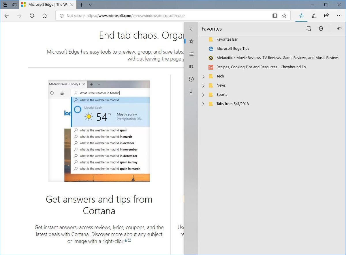
The Hub is that panel that slides out from the right edge where you can view your favorites, reading list, books, history and downloads. Previously, it was a narrow column where the text ran off the side of your screen. Now, it’s wider and much easier to use. The Hub also adds a “Create new folder” button, which was hidden behind a right-click contextual menu in previous versions. Small but thoughtful improvements make Edge’s Hub bigger and better.

Screenshot by Matt Elliott/CNET
Fullscreen improvements
Hitting F11 to enter fullscreen mode was always kind of a bummer with Edge because when you moused to the top of your screen, all that Edge would show you were the three buttons in the top-right corner to minimize the window, exit fullscreen mode or close Edge. This meant that you needed to exit fullscreen mode to do anything other than those three actions. Now, when you mouse to the top of Edge in fullscreen mode you see those three buttons but also your open tabs and the URL bar, creating a fullscreen mode you are much more likely to use.
Print without the clutter
It’s like reading mode but for printing. Edge now lets you print web pages without all of the ads and images. When you hit Ctrl-P to print a page, you’ll see a new Clutter-free printing option. Say “yes” to freeing the page of clutter to print a text-only version, which makes it easier to read and saves paper (if you insist on printing web pages, that is).
These Windows 10 PCs let you sign in with your face or finger
