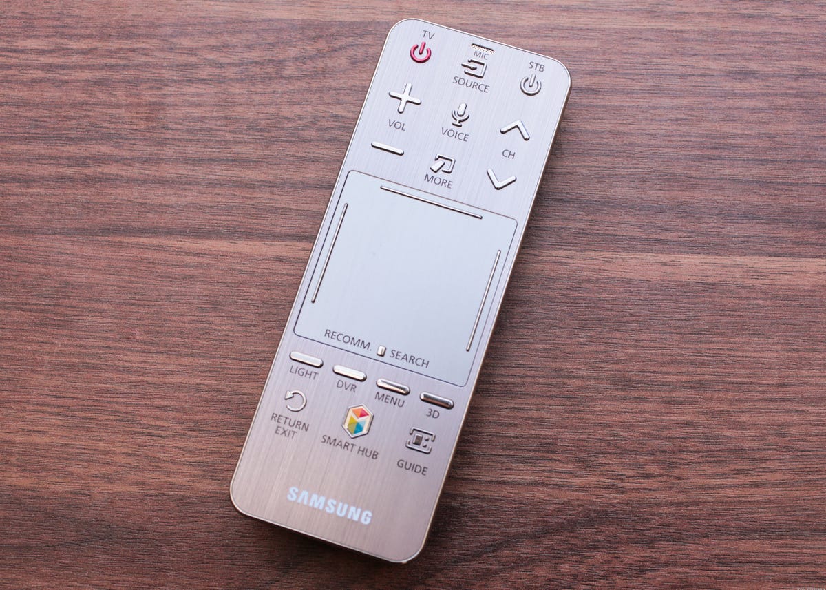
LAS VEGAS — Samsung Electronics recently announced the release of its 2014 Smart Control, the remote included with most of its new Smart TVs, and today we got the chance to try one in-hand.
The updated clicker now supports motion control a la a Nintendo Wiimote or LG Magic Motion wand, and it also includes a touch pad. The touch pad is one-fifth the size of last year’s.
It supports a swiping left/right gesture to flick between Samsung Smart Hub panels or content listings across multiple pages. It’s now bounded by four directional buttons enabling users to “access their content more accurately.”


Sarah Tew/CNET
After a few minutes playing with a preproduction version at CES, we can report it is indeed better than last year’s. Resting your thumb on the touch pad tells the remote to engage motion control mode, summoning up a cursor you can direct quickly and accurately around the screen. It works just like LG’s remote (or a Wii), but I really appreciated the ease with which I could enter and exit motion mode.
One big reason I liked LG’s interface so much last year was because motion control eased use of the “virtual remote” — the little pop-up on-screen clicker that includes all the functions they decided to eliminate as buttons from the actual physical remote (like “Set-top box menu” and “DVR list”). Choosing and clicking one of those buttons was much easier and more natural than it was on last year’s Samsung Smart TVs, thanks to motion control and more selections on the virtual clicker. Not as easy as hitting an actual button, but better than before.
The extra physical buttons are also very welcome. We complained quite a bit about the lack of dedicated, DVR-friendly “transport” controls for play, fast-forward, and rewind on the 2013 remote, and Samsung listened. The updated clicker returns with these old faves, although it’s still missing forward and reverse skip.
In my closed-door demo I advocated hard for Samsung to add those to the final version, replacing the “MTS” and “CC” buttons. If that happens, I expect you all to thank me. The company’s designers and engineers assured me the final choice of buttons was still up for debate.
One notable dedicated button that will be included is Multi-Link Screen, said to enable “users to watch multiple contents simultaneously on a single screen.” It puts live TV on one side and an app or Web page on the other. In my demo that feature worked well too, and I appreciated that the non-TV half of the split screen could read the TV half’s metadata, automatically initiating a YouTube or Web search based on what show you’re watching.
Arguably the biggest change is the new shape, which mimics the pebble design of Samsung’s old mini-remotes and comes with a textured grip on the underside. It felt “right” in the hand, and again reminded me of a refined version of the LG wand.
As in previous years, the remote includes a microphone for content searching and playback control using “natural language.” Like, you know, “Hi, TV!” It’s also Bluetooth, so you don’t need line-of-sight to the TV.
Check out more on Samsung’s 2014 TV releases at CES 2014.
Correction: An earlier version of this story, based on Samsung’s somewhat unclear initial press release, said that the remote wouldn’t have motion control. In fact, it does. The mockup above includes a Soccer button, which the earlier version of this story derided. The preproduction version I played with lacked that button, so I’ve reluctantly removed my derision–for now.


