It took Google an entire year to deliver a major update to the first round of Google TV products, and it has not been worth the wait.
When Google announced the Honeycomb update last week, we had a twinge of optimism, based on the slick press photos and the stated mission of simplifying the user experience, which was sorely needed. But after playing with our Sony NSZ-GT1 Blu-ray player with Google TV for several hours today, our initial impressions were mostly of frustration.
Google TV Honeycomb update (photos)


New user interface and the TV & Movies app
The redesigned graphics for Google TV are an improvement and that starts with the home screen, pictured above. You get a row of icons, including Netflix, the new TV & Movies app, and the Android Market.


Matthew Moskovciak/CNET
The slick look continues with the TV & Movies app, which is really by far the best element of the Google TV update. Google has picked up on some of the smart design elements shared by the Apple TV and Vudu, letting you browse large cover art. It also makes some effort to search for content across multiple platforms, including Amazon Instant and Netflix.


Matthew Moskovciak/CNET
While it looks and sounds good in theory, the actual user experience is pretty terrible. We clicked to rent “Bridesmaids,” which then gave us the option to rent from Amazon Instant, without showing the exact price. You’d think selecting that option would start the movie, but instead it kicks you to the Chrome browser and the Amazon.com page for “Bridesmaids.” From there you have to navigate using the finicky cursor to click on the $3.99 rental option. And the first three times we tried to play an Amazon video, it didn’t start. (We did eventually get a video to play.)
Our Amazon Instant integration woes go beyond that. Google doesn’t know which videos are Amazon Prime videos, which should be free for subscribers, nor does it know which content you already own on Amazon, which should show up as free. Even the basic apps included on LG and Panasonic home theater products are much better.
Search
Search has been improved and Netflix results are now included, but the experience is still cumbersome.


Matthew Moskovciak/CNET
Let’s say you want to catch up on the canceled-too-soon TV series “Party Down.” Hit the search button, type in “Party Down,” and it shows up, although you’ll need to navigate to the TV & Movies icon. Then you’ll go to Google’s TV series page for “Party Down,” where you can select a season, then an episode, then where you want to watch it: Amazon (to purchase) or Netflix (free).
After all that, it finally launches the actual Netflix app and you have to hit play again. It ends up feeling like a lot of work after that initial “I want to watch ‘Party Down'” impulse and you start to wonder why there isn’t a Netflix icon right on the first search screen.
Errors, controllers, and other headaches
Then there are the error messages. The frequent, cryptic error messages. We ran into three of them within my first 4 hours of testing the new update, and that’s not counting any of the times where I felt flat-out lost in the Google TV user interface.


Matthew Moskovciak/CNET
Take away all the errors and there’s still the issue of Google TV’s controllers. (The fact that you have to say controller rather than remote is the first sign of trouble.) The over-70-button controller for the Sony NSZ-GT1 is intimidating even for a tech pro, and we frequently found ourselves hitting the wrong button or having to search the controller for something as basic as the Pause button.


Matthew Moskovciak/CNET
We like the Logitech Revue’s wireless keyboard more, but not many people will tolerate a full-scale keyboard in the living room. Contrast that with the simple remotes for the Apple TV and Roku 2 XS. Those boxes don’t offer all the functionality of Google TV, but they’re much more enjoyable to use.


Matthew Moskovciak/CNET
Google offers an iOS and an Android app for controlling Google TV devices and, again, the user experience is lacking. We used the iOS app, which had difficulty connecting to the Sony NSZ-GT1 in the first place, and after it did, it crashed frequently when we tried to use the voice search feature. Even the regular remote is so cluttered that we can’t imagine it using it regularly.
Android Market


Matthew Moskovciak/CNET
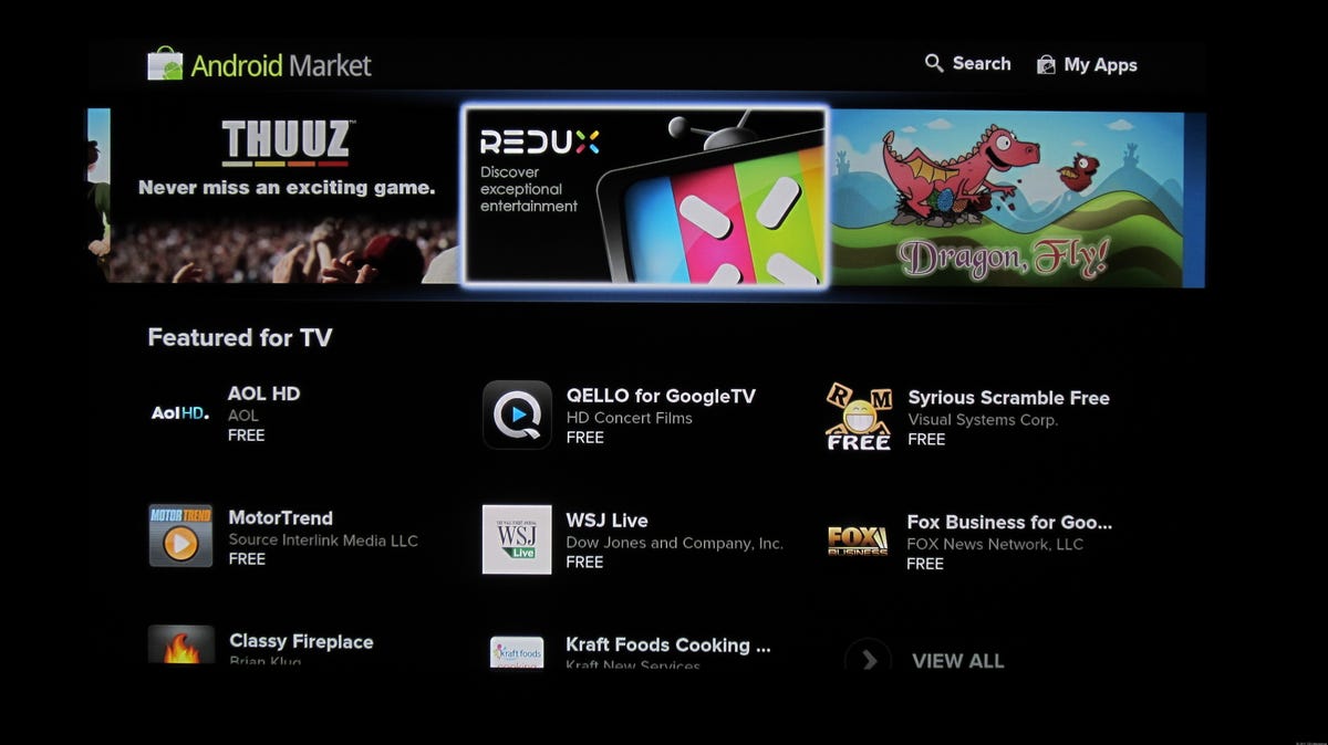
The Android Market is the other major addition included in the Honeycomb update. While Google TV definitely needs additional apps, the initial slate only offers a few programs we were interested in downloading. Popular apps like Hulu Plus and MLB.TV aren’t there yet, although it’s possible they’ll follow if Google TV receives developer support.


Matthew Moskovciak/CNET
Aside from the selection, we were surprised by how easy it was to go from browsing TV-optimized apps to browsing plain old Android apps that are optimized for a phone display. Having simply selected “Other apps” from the main Android Market interface, we were greeted by tons of apps that don’t make any sense on Google TV, like a battery manager. In some cases, it was nice to have access to these phone apps–Rhapsody’s app worked pretty well on the TV–but it’s something that could easily cause confusion.
Wrap-up
It’s not worth getting into all the frustrations I ran into during my half day of hands-on time, but they exceed what’s written here. We’ll continue testing Google TV as we re-evaluate the Sony NSZ-GT1, the Sony NSX-GT1 series of LCDs, and the Logitech Revue, including its integration with more-traditional TV programming, which we didn’t look at in this initial hands-on.
With all the bugs and limitations we ran into in just half a day, it’s hard to imagine this update being anything other than a disappointment for Google TV early adopters. While we still think Google TV has some merit as a concept, the implementation needs a ton of work to compare with other streaming-media boxes like the Roku 2 XS, Apple TV, and PlayStation 3.


