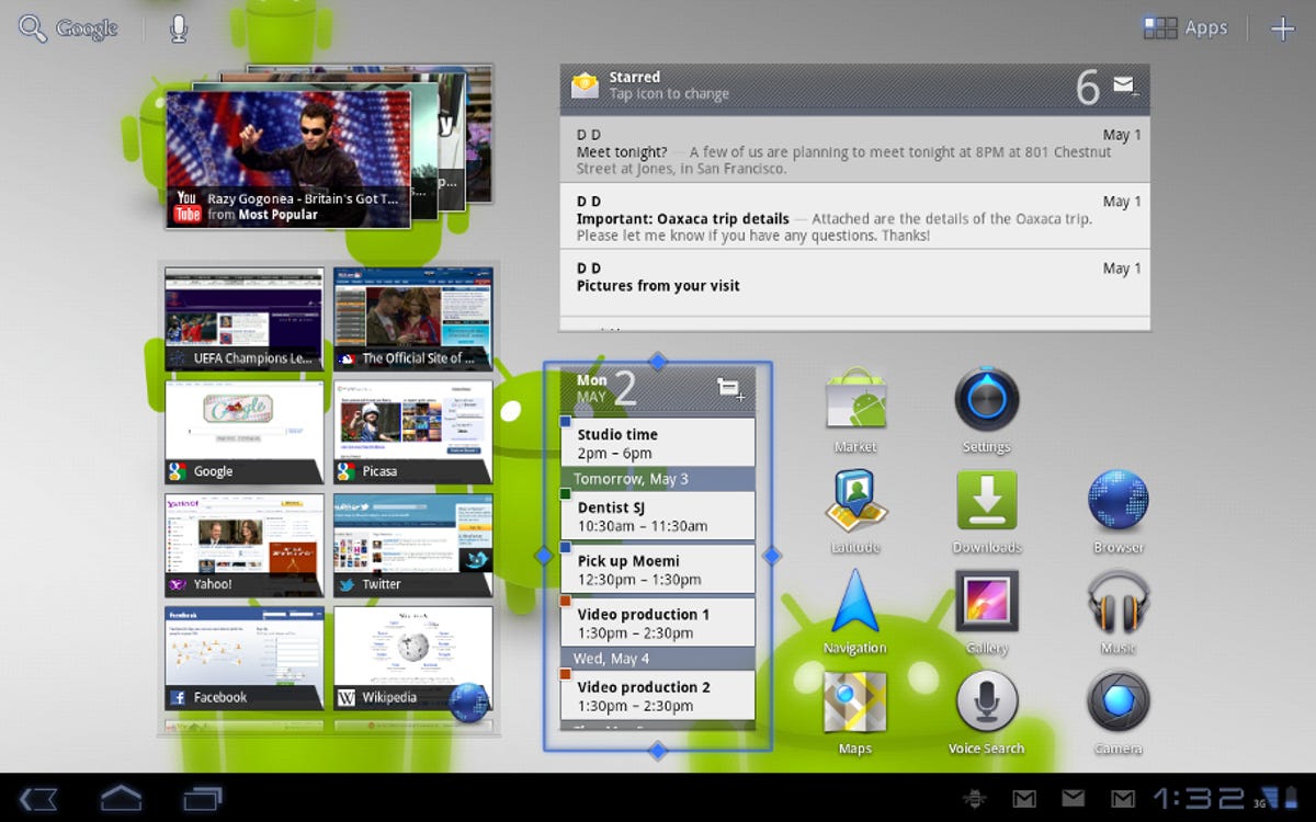
When Google announced Android 3.1 Honeycomb was coming to the Xoom last week, I was pretty excited. Honeycomb’s already a great tablet OS, so any improvements could only add to its functionality and efficiency. Unfortunately the version 3.1 update was released over the air and was rolled out in spurts. Our Xoom didn’t receive its update until earlier this week. Google detailed changes to expect, but I wanted to check and see just how well some of them were implemented.
Browser
Aside from a few annoyances, I thought the Chrome browser in Honeycomb 3.0.1 was well-made, but there’s always room for improvement. The biggest change in version 3.1 is the updated Quick Controls feature.
With this enabled, swiping either left or right from the edge of the screen and pressing down will bring up the menu. Through Quick Controls, you can quickly get all the functionality of the normal browser, with the added benefit of being able to preview open tabs before selecting them.
Although I was dubious at first, after using Quick Controls for a few minutes, I actually now prefer it to the normal interface. It makes for a cleaner screen, and you still have quick access to options.
One of the cosmetic differences between Honeycomb and iOS is the smoothness of Web site scrolling and zooming. With version 3.0.1 the Xoom’s performance was choppier in comparison. I liken it to watching a game run at 30 frames per second (fps) versus one running at 60fps. The 30fps game looks great, until you see the much smoother 60fps game running next to it. Google has addressed this by improving the smoothness of scrolling and zooming to a level comparable with the iPad 2.
Some sites default to their mobile or Android version, and the only way around this is to access the UA String by typing “about:debug” in the address bar, navigating to Settings>Debug>UAString, and then switching to Desktop. Unfortunately, with Honeycomb 3.1, if you’re typing in the address bar, the colon key is unavailable. It’s available in other fields, like Google search, however. Our workaround? Type “about:debug” in the search field, then copy it to the address bar. I’m still baffled as to why this particular detail was changed.
General interface
Waiting for the Honeycomb 3.1 update to roll to our Xoom was frustrating, especially since the only way to actively check for the update was to reboot the tablet, inducing an automatic check. In version 3.1, Google has thankfully implemented a Check for Update button, allowing you to look for an update much more easily.
Contacts now allow for full text search. You can search for any term stored with your contacts, like street name or apartment number, and not just names. Pretty convenient. Also, in Gmail you can now change labels on an e-mail, so that it appears under different labels. Lastly, widgets can now be resized both vertically and horizontally, adding another level of customization.
Web speed
I tested the Xoom running Honeycomb 3.1 with our usual Web test methodology. I also retested the LG G-Slate, as at the time it was the only other tablet I could get my hands on. Comparing version 3.1 performance to 3.0.1 on the Xoom, there’s been an obvious degradation in Web site loading speed across the board.
table.geekbox th{background-color:#E6ECEF;text-align:left;font-weight:bold;}
table.geekbox tr.even{background-color:#CCCCCC;}
.ratingGood{color:#093;} .ratingAverage{color:#666;} .ratingBad{color:#C00;}
| Web site | Motorola Xoom (Honeycomb 3.1) | Motorola Xoom (Honeycomb 3.0.1) | T-Mobile G-Slate by LG |
|---|---|---|---|
| GiantBomb.com | 9 seconds | 5 seconds | 6 seconds |
| CNET.com | 9 seconds | 5 seconds | 5 seconds |
| CBSNews.com | 13 seconds | 8 seconds | 7 seconds |
Missed opportunities
There are two sticking points I had with Honeycomb that I completely expected to be addressed in version 3.1. While they’re likely not major issues to most, as someone who tests tablets for a living, I was really holding out hope for these. On the Asus Eee Pad Transformer, Asus took it upon itself to add an additional screen timeout option. Usually it tops out at 30 seconds, but the Transformer has a Never option. Disappointingly, this isn’t included in version 3.1.
Also, why is it necessary to induce a debug state in the browser in order to choose desktop versions of Web sites as your preference? This should be an option available in general settings as far as I’m concerned.
Which brings us to a final problem, which may be more akin to a bug than a missing feature. Once you’ve induced debug mode in the browser and selected Desktop as your preference for Web sites, you’d figure this would be the case until you changed it again. Not so much. After an unspecified amount of time, mobile Web sites will start popping up again when you navigate to a site that has that option; however, the UAString still has Desktop selected. Google, if you’re going to give us the option, at least allow it to work consistently.
Conclusion
Honeycomb 3.1 mostly moves in the right direction, and I especially like some of the new general and browser functionality. I loved the performance increase when scrolling though Web pages, but was disappointed that Google made it more difficult to access desktop versions of sites. Also, checking for an update is something that should have been in from the get-go, but we’re grateful it’s here now.
Web site loading speed is obviously disappointing and I hope to see that addressed soon in a mini-patch. As for the missed opportunities, we’re holding out hope these changes are on the list for Honeycomb 3.2.


