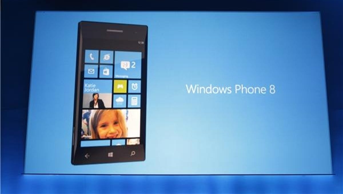
Windows Phone 8 is getting a new look. The distinctive colourful animated squares of the home screen can be made bigger or smaller to make your phone as simple or as cluttered as you like.
At the moment, you can only fit two columns of live tiles on the home screen, which means a lot of scrolling down as you add more stuff. But in Windows Phone 8, you have the option to change the size of the live tiles, giving you up to four columns.
Now, I love the look of Windows Phone. I think the blocky, colourful interface is gorgeous and well suited to mobile screen sizes. I have to admit my first reaction to the new look was to think it’s too darn cluttered.
But I’ve thought about it and I’m sold now — because the key thing is that you can change the size of the tiles. Doing that is a simple matter of pressing and holding on a tile, which gives you the option to remove or resize it. You can mix and match sizes, so you can have the essential stuff spanning the screen, with a hotch-potch of small tiles for the less important things.
The tiles continue to show information about the app they represent, even when they’re shrunk in size. That’s what makes the example home screens shown off in Microsoft’s demonstration look cluttered. But at least you have control over the density of data displayed. And you can keep the current uncluttered look of the home screen simply by setting your phone to the two-column view.
Another benefit of Windows Phone 8 is that it supports new screen resolutions, including high-definition 720p screens. So even with loads of tiles thrown at your home screen, everything will still be crisp and packed with information.
What do you think of the new-look Windows Phone 8? Tell me your thoughts in the comments or on our Facebook page.


