Sarah Tew/CBS Interactive
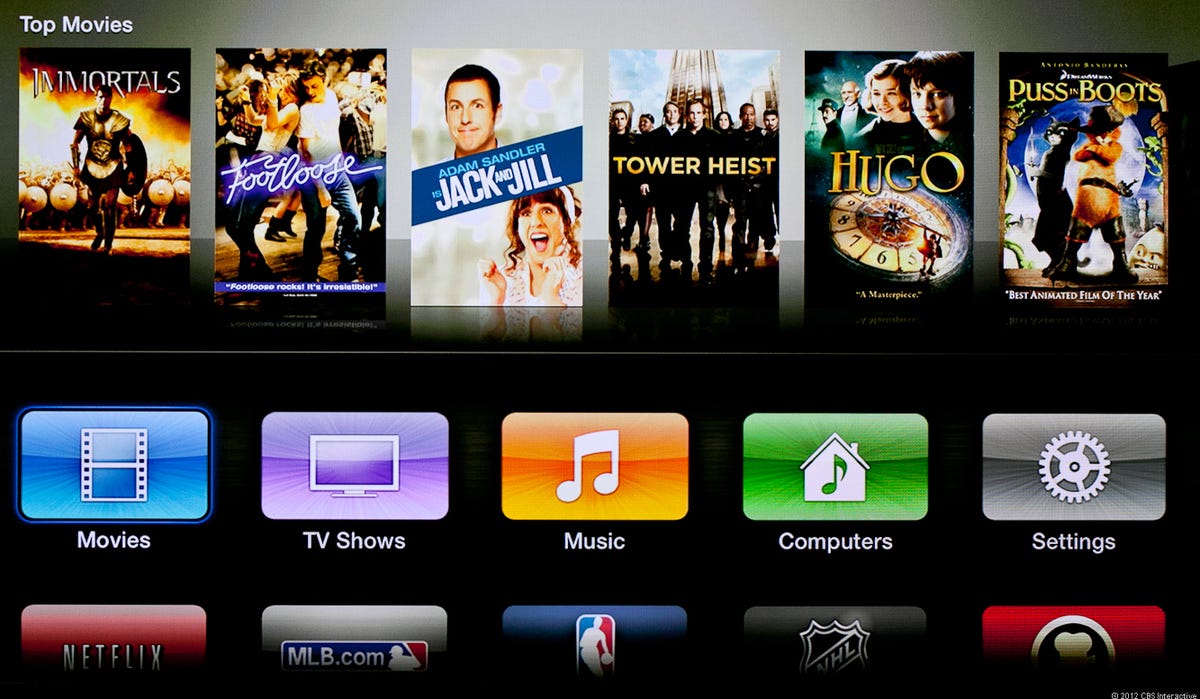
The new Apple TV is getting 1080p, but the redesigned user interface is coming to both new Apple TV models and existing 2nd-gen models. The software update for 2nd-gen Apple TV boxes is already available today, so I installed the update and was able to take the new interface for a spin.
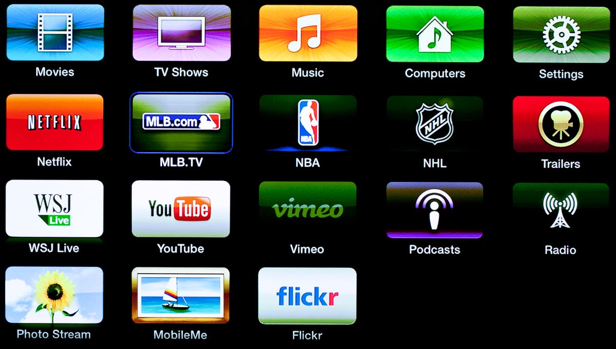
Not everyone realizes that the Apple TV actually runs on the same iOS software that powers the iPad and iPhone, but this latest update make it a lot more obvious. Gone is the “list”-type menus from the old interface, replaced with a grid of icons that makes your TV look a little like a giant iPad. It’s a much more colorful look, but the giant grid of icons looks a little less organized to our eyes. At the very top of the main screen is cover art of “top content” that changes depending on what media type is selected (movies, TV shows, music).

Sarah Tew/CBS Interactive
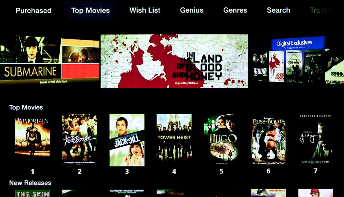
If you jump into the iTunes Store for either movies or TV shows, the interface has also been somewhat updated. Along the top is a carousel of popular content, followed by the traditional grid of cover art underneath. Once you select a movie, the summary page looks identical, although that’s not a bad thing since it’s the best presentation we’ve seen on a streaming video box. While you’ve been able to re-stream purchased TV shows for quite some time, the same functionality has also been added for movies, with a new “Purchased” menu options running along the top.

Sarah Tew/CBS Interactive
Related stories
- All iPad coverage from CNET
- First Take: Apple’s new iPad
- Apple iPad with Retina Display makes its debut
- Apple’s new iPad gets 4G LTE
- Apple TV announced, with 1080p
- Apple iOS 5.1: First Take
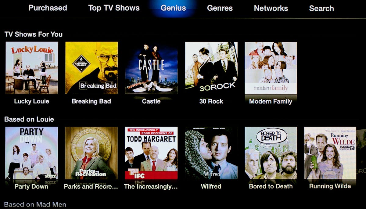
The other new feature in the top menu bar is “Genius”, which is Apple’s recommendations engine for content. It’s easy to to see this as a ho-hum feature, especially since recommendations are such an integral part of Netflix already, but it’s a needed addition to the content browsing experience. I’d have to use it quite a bit more to see if the suggestions are consistently worthwhile, but the initial picks for TV shows (based on the fact that I bought an episode of “Louie”) seem on the mark: “Party Down”, “Parks and Recreation”, “The Increasingly Poor Decisions of Todd Margaret”, “Wilfred”, “Bored to Death” and “Running Wilde”.

Sarah Tew/CBS Interactive
Beyond the main user interface, the update is only skin deep. Services like Netflix and MLB.TV have the same user interface as before, which is a bit of a disappointment, especially for Netflix, since I prefer the more visual interface available on other devices like the Roku LT, Sony PS3 and countless Blu-ray players. The iTunes Match interface is also the same and it’s a little surprising that you still can’t purchase music from the iTunes Store on an Apple TV.


Sarah Tew/CBS Interactive
I’ve only spent about an hour or so with the new user interface, but there doesn’t seem to be much more beyond that. I’ll be doing a full review with the new hardware when it become available next Friday, but right now it seems like the major advantage to the new hardware will be the 1080p interface and 1080p content (both Netflix and iTunes Store). (Perhaps higher resolution AirPlay mirroring will be available too, but I haven’t seen confirmation of that yet.) If you have a 2nd-gen Apple TV already, that’s not much of an incentive to upgrade.
Apple’s new Apple TV hands-on (photos)


+6 more

