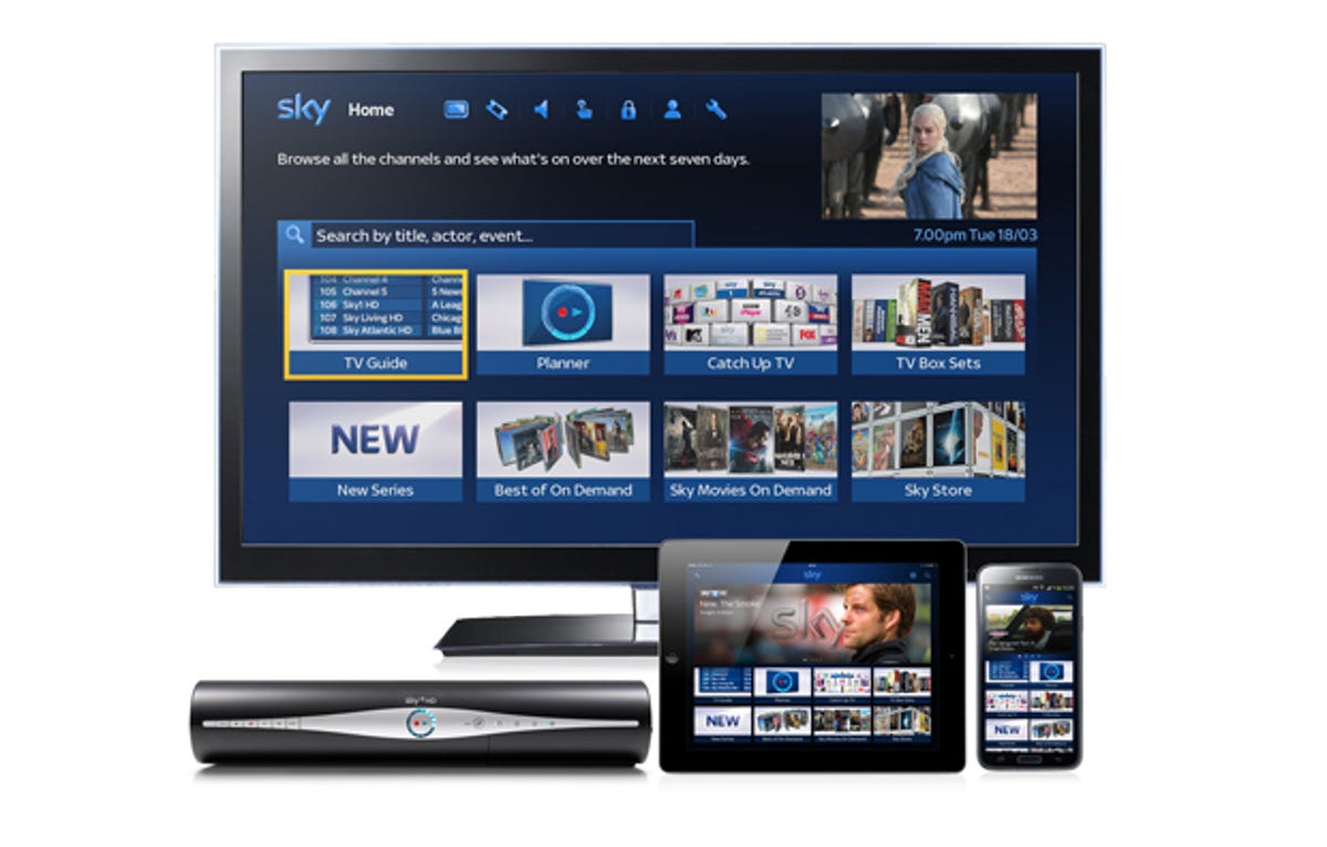
Sky’s giving its programme guide a new lease of life with a smart TV-style homepage, rolling out to Sky+ HD boxes from today.
The new design sees catch-up services and on-demand box sets getting equal billing with live TV, as the UK’s biggest pay-TV company adjusts its services to how we all watch our telly in the modern world.
Search has been revamped, so you can find shows and movies by actor, event, title or other key words. Results reflect what other people are searching for and watching, Sky says, meaning more relevant programmes should be easier to find.


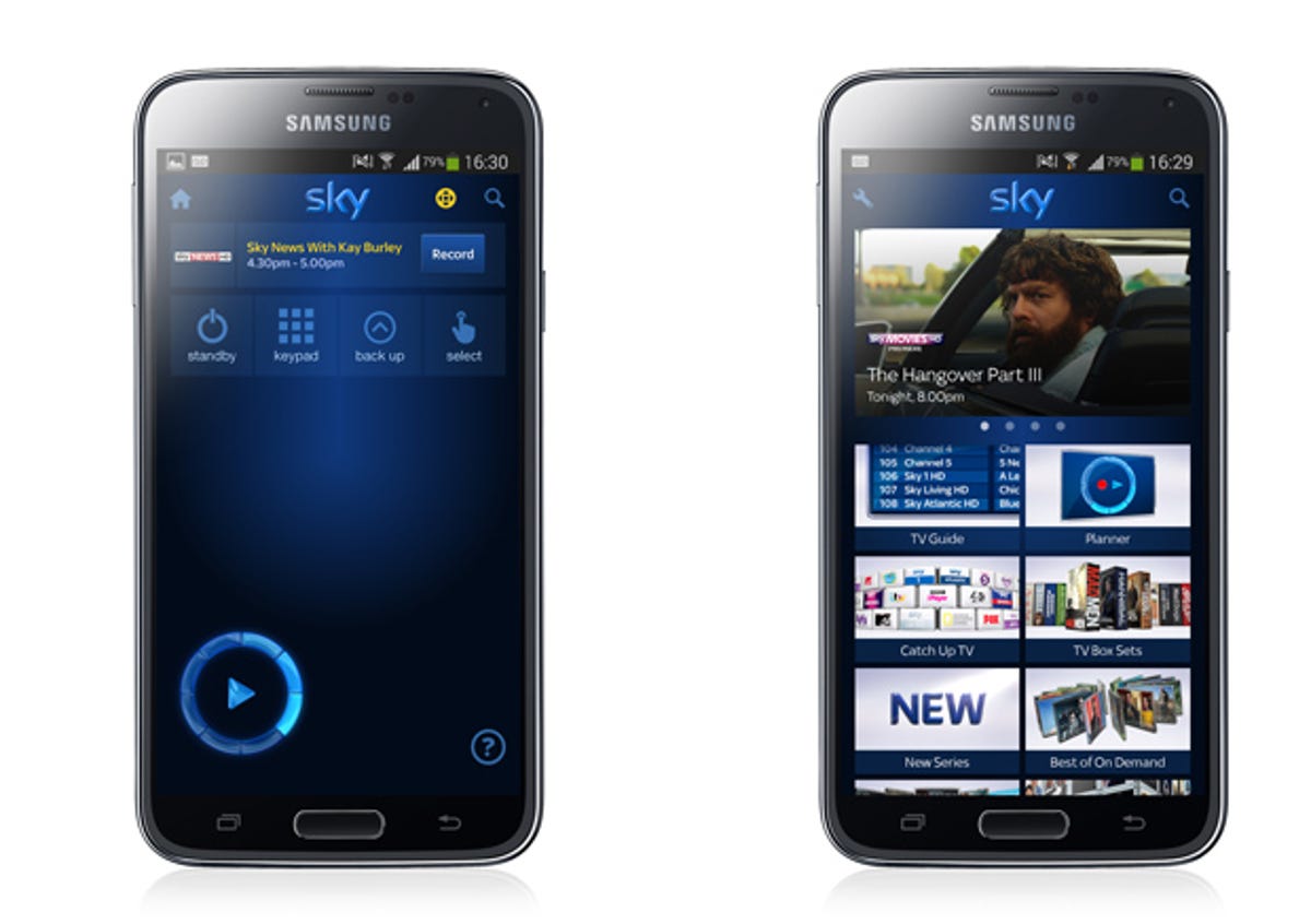
The Sky+ mobile and tablet app is getting a lick of paint too, reflecting the new look, and for the first time letting you turn your Sky box on and off.
“Our new Homepage means it’s now much easier to quickly find what you want, when you want to watch it — whether that’s the big Premier League clash or catching up on Game of Thrones,” said Sky’s brand director Luke Bradley Jones. “The new home page is a really important innovation, putting Sky+ at the heart of the connected home. And there’s even more to come, with a smart new approach to recommendations coming later this year.”
Recommendations will take their cue from what you download and record with the Planner, so they should be more relevant to your actual viewing habits.
Sky promises the update will be available on all Sky+ HD boxes by the end of May, as long as it’s connected to your home broadband.


